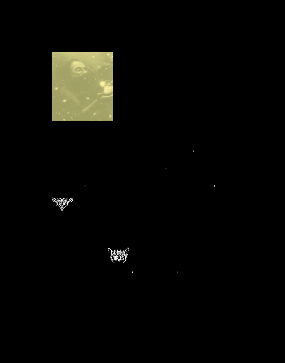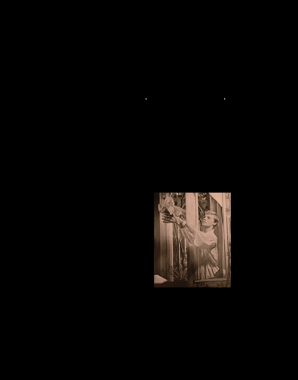


“In Ashenfolk I turn my attention to science fiction, fantasy and horror genres. I’m interested in how writers and filmmakers build the worlds of their books and films—the language used to describe the landscapes that permeate those worlds, and the creatures and races that inhabit those worlds. At the same time, it’s about my parents’ generation (roughly the generation of the 1960s and 1970s), and the worlds they attempted to build, and the words they used to describe those worlds—but also about how their world-building ultimately failed, both in everyday life as well as in more intentional communities like communes and spiritual cults. Part of the book traces the development of rock and (finally) hip-hop graphic design during this era, uncovering its incorporation of Victorian, Gothic, and Art Nouveau elements, as well as Hammer horror and psychedelic typography.”
— Joseph Mosconi in an interview with rob mclennan
A comment on genre and latent form as a type of minimalist poetry, this excerpt from Joseph Mosconi’s book Ashenfolk contains a portion of a transliteration, from standard Roman typeface to a typeface called Black Metal G, of Arthur Machen’s 19th century proto-horror novella The White People, the full text of which is available here.


