J for Jim Crow
December 15th, 2021
Three years ago, while on summer vacation, I was browsing the children’s book offerings in a used bookstore in Portland, ME. I had my toddler in tow, who at twenty months had approximately twenty words in his vocabulary. Needless to say, I was very excited about my son’s budding communication skills. So when I stumbled across The Alphazeds, a wacky picture book about the alphabet illustrated by graphic designer Milton Glaser and written by his wife, Shirley Glaser, I immediately bought it. Each letter is drawn in a different font and is anthropomorphized with alliterated personality—Angry A, Bashful B, Confused C, et cetera. The letters exist in a Hobbesian state of crankiness and war until the lights go out and the letters get scared and end up forming the very first “word” in an effort to comfort one another.
The book was a hit with my son; in the years since I’ve probably read this book aloud a hundred times. But just recently, as I was flipping through the endnotes, I noticed something that gave me pause. Glaser wrote that all the Alphazeds in the book are “based on real characters that belong to typographic families, with curious names.” I skimmed through: A is written in “Aurora,” B in “Bodoni,” C in “Corinthian”…

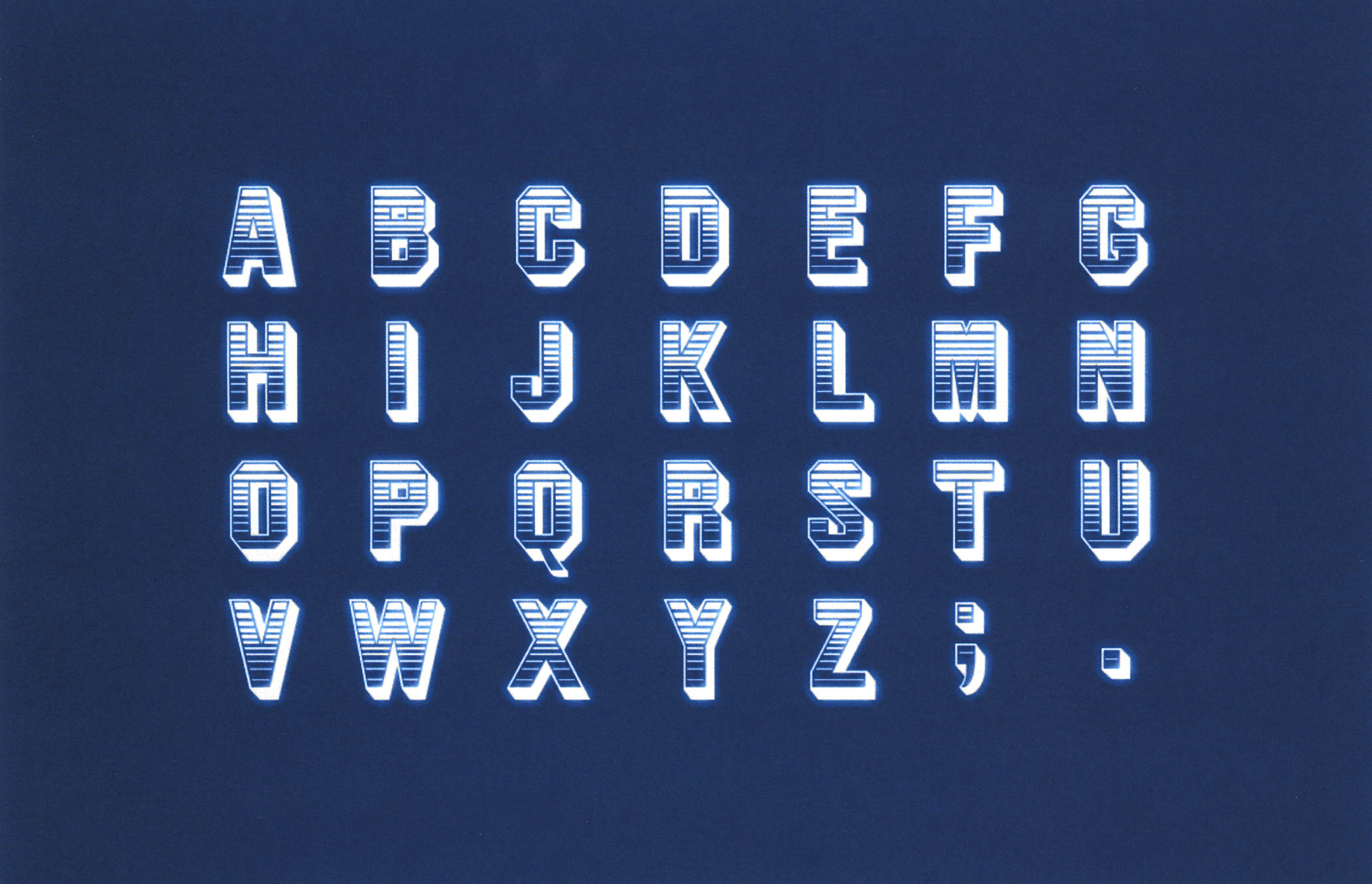
Why is a typeface named Jim Crow? In the digital era we use typography effortlessly, scrolling through hundreds of options, serif and sans serif, bold and thin, choosing fonts for their aesthetics and legibility. Oftentimes software makes font choices for us, and we go along with the default. It can be easy to think of typography as neutral, disassociated from politics and culture. But of course, typography is made by people, and thus cannot be separated from human history. Jim Crow minstrelsy is a major part of American history, and its racist legacy touches many aspects of American society today, from music to pancake syrup packaging to the criminal justice system. Just as Jim Crow attitudes about white superiority didn’t die with the repeal of segregation laws, racism remains embedded in the world of design.
Jim Crow, the typeface, has its origins in the mid-1800s, not long after Jim Crow, the blackface minstrel character, was invented in 1828 by white entertainer Thomas Dartmouth “Daddy” Rice, the “father of American minstrelsy.” When performing as Jim Crow, Rice applied burnt cork to his face, dressed in rags, did a song and dance act, and generally played the fool to get laughs. Rice became the most popular blackface performer of his time, “Jump Jim Crow” became a hit song, and his character was copied by many other minstrel acts. Subsequently, the phrase “Jim Crow” entered the American vocabulary as a pejorative term for African Americans, and after the Civil War, racial segregation mandates came to be known as “Jim Crow laws.”
But the connection between the minstrel character Jim Crow and the Jim Crow typeface was not immediate. Originally, when the Boston-based Dickinson Type Foundry introduced the typeface to the American typography scene, its name was “Gothic Shade,”[1] which is essentially a description of the design. “Gothic” means sans serif and “shade” refers to a shaded pattern in the type. The story of how “Gothic Shade” became “Jim Crow” reflects the sticky and stubborn nature of racism in American society.
The majority of typefaces in the world, from the invention of the printing press until the mid-nineteenth century, had descriptive names that conveyed their size and style, or sometimes had no names at all and were simply numbered. There were three main type styles: roman, italic, and blackletter.[2] But there was an explosion of new type styles in the Victorian era, when the industrial revolution spawned the birth of mass communication. This was the heyday of printed material: newspapers, magazines, dime novels, advertisements, railway tables, posters, and more. The printing industry grew to become one of the biggest in the United States. More print required more type, and metal type foundries started casting thousands of new typefaces. The appetite for fresh, eye-catching designs was voracious: nineteenth century broadsides often included more than fifteen different typefaces on one page.
So what was Gothic Shade used for? Unfortunately, it’s not the kind of thing that’s easy to look up—there’s no typographic cross-index of historical printed material. But there are some clues: Gothic Shade was only cast in uppercase letters and in a large size, which limited its usage. It’s the kind of decorative typeface that was meant to catch a viewer’s attention on paper ephemera. Most evidence has been lost to time, but the one example of Gothic Shade I did find was on an 1862 poster, advertising a Morris Brothers, Pell & Trowbridge minstrel show in Boston, MA.
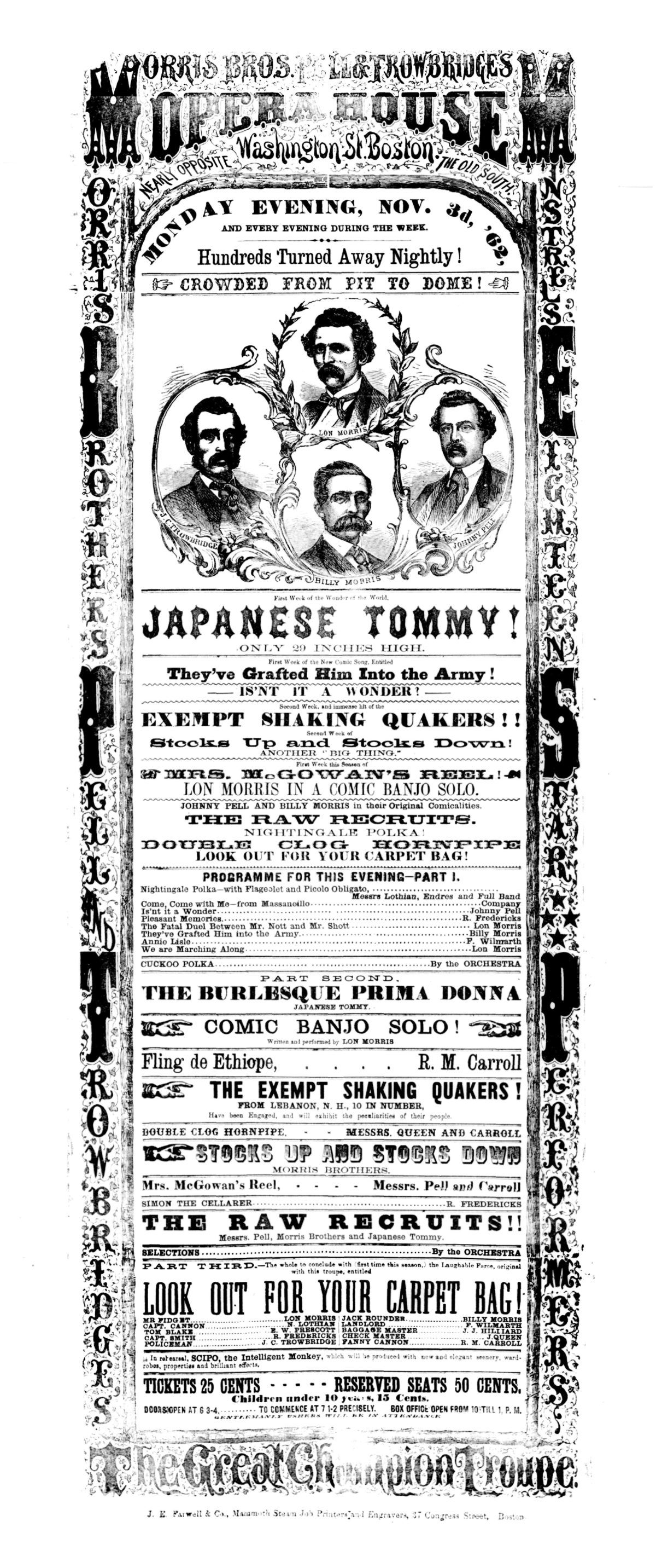

So even before it was named Jim Crow, Gothic Shade was being used to advertise minstrelsy. But how and why did it come to be renamed?
“The nineteenth century typography world was cutthroat,” Anna Conroy, founder of the Type Heritage Project, told me. Foundries started competitive price wars over type, and margins grew slimmer. Conroy described a “dog-eat-dog” atmosphere of rampant typeface piracy. The technological advance of electrotyping allowed foundries to clone the typefaces of their competitors quickly and cheaply. Soon after Dickinson started selling Gothic Shade to printers, multiple American foundries copied it and began selling the typeface themselves, a common tactic. In fact, Conroy found evidence in an 1853 French specimen book that Gothic Shade originally entered the American market after being pirated from a French foundry, Fonderie Générale, with the Americans only making a subtle tweak to square the edge of the letter “N.”
It was during this era of type piracy that the idea of giving typefaces unique and memorable names caught on. Essentially, it was an American marketing innovation. The old descriptive names were generic and forgettable; imagine trying to remember what the typeface “Ornamented No. 1514” looks like. “Producers figured out that interesting trade names helped to sell their wares,” said Conroy. Naming (and subsequent trademarking of the names) was also a way for type foundries to protect their work. “You can still steal typefaces, but you can’t steal names,” Paul Shaw, a graphic design historian, calligrapher and typographer told me. The trend of catchy typeface names took off at the end of the nineteenth century. At the same time, American type foundries were collapsing under the strain of price wars, piracy, and the invention of Linotype. So in 1892, twenty-three of the biggest and most prominent foundries merged to form American Type Founders (ATF). The New Jersey-based company eventually became one of the most important type foundries in the world—and it’s the place where Gothic Shade was rechristened Jim Crow in 1933.
Why did it take so long? Not long after the ATF merger, Gothic Shade basically disappeared. “Gothic Shade was probably scrapped, just melted down, thrown out,” Shaw said. “Type took up a lot of space. You had to have drawers and cabinets and shelving and warehouses.” By the early twentieth century, aesthetic trends in typography had shifted dramatically. Style was moving towards art nouveau, art deco, European modernist design. Futura was in. Blocky, bold typefaces like Gothic Shade were out. According to Shaw, twentieth century designers by and large considered nineteenth century typography to be “crap.”
If Gothic Shade was considered garbage, it’s all the more puzzling that ATF reintroduced it in the thirties. “The idea of reviving this type at this moment seems so weird,” Shaw said to me. He speculated that it may have been financial pressures that led ATF to revive the typeface. ATF had severe fiscal difficulties during the Great Depression, largely because printers cut back on typefaces. “If you’re a printer, you’ve got to keep buying paper to print. You’ve got to keep buying ink. You don’t have to keep buying type.” To stay afloat, ATF had to convince printers that their new typefaces were going to be the next big thing in typography. They needed to manufacture a trend.
ATF’s advertising manager and librarian, Henry Lewis Bullen, was a major player in the printing industry. After digging through Bullen’s papers[3] with the help of Columbia University librarian Jane Siegel, I located a clue to the origins of the Jim Crow typeface: an article by design critic Fred T. Singleton that appeared in a 1933 edition of The Inland Printer, the industry’s preeminent trade magazine. Singleton’s article gushed about old typefaces of the nineteenth century “romantic era.” It appears that someone at ATF—likely Bullen—was inspired to revive Gothic Shade and market it to printers after reading Singleton’s article. In the ATF archives, Siegel and I discovered a circular that company salesmen distributed to printers across the country. It was a reprint of Singleton’s three-page article, with an additional page advertising ATF’s newest typefaces. The text at the top of the page reads: “The American Type Founders Sales Corporation presents the following twentieth century interpretations of old-time types of Victorian days, in sizes and fonts as listed.” Below, there are specimens of five Victorian typefaces that were all rebranded by ATF in 1933: “P.T. Barnum,” “Gold Rush,” “Marble Heart,” “Old Bowery,” and “Jim Crow.” Jim Crow is printed with the words “Romantic Typography.” And with this play to market Victorian typefaces to American printers in the Great Depression, Gothic Shade was dead and Jim Crow was born. The typeface had come full circle: seventy years after being used to sell tickets for a minstrel show, it was ultimately given the name of minstrelsy’s biggest star.
Shaw speculated on why ATF’s marketing team renamed these five Victorian typefaces: “They’ve got these names that are boring and aren’t going to sell at all in 1933 America,” he said. So “Antique Shaded” became “Gold Rush” and “Gothic Double Shade” became “Marble Heart.” But still, Jim Crow? When I asked if Shaw thought ATF might’ve been sending a coded message in support of racial segregation, he scoffed. Rather, Shaw thinks ATF was simply looking for catchy names that were a shorthand for nineteenth century American culture—an undeniably a racist culture. You can see it if you look at popular newspapers from that time; minstrel shows were mainstream. “It was just part of the entertainment landscape,” said Shaw.
ATF’s marketing effort worked. Jim Crow wasn’t a bestseller, but it sold well enough that ATF recast the typeface again in 1949.[4] Indeed, the name “Jim Crow” didn’t put off graphic designers from using the typeface. A modified version of it pops up on some posters for Disney’s DUMBO[5]—not surprising considering that one of the singing crows in the film was named “Jim Crow” in the script (and voiced by a white actor). In addition to appearing in Milton Glaser’s Alphazeds, the typeface was printed on a variety of book and album covers, including Philip K. Dick’s Do Androids Dream of Electric Sheep?; John Lennon & Plastic Ono Band’s album art for Shaved Fish; jazz musician Pee Wee Hunt’s album art for Dixieland; and even the German issue of Stevie Wonder’s single “Higher Ground.” While consumers of these books and albums likely had no idea of the typeface’s name or origin, the graphic designers did. They made a choice to use Jim Crow in spite of, or because of, the name.
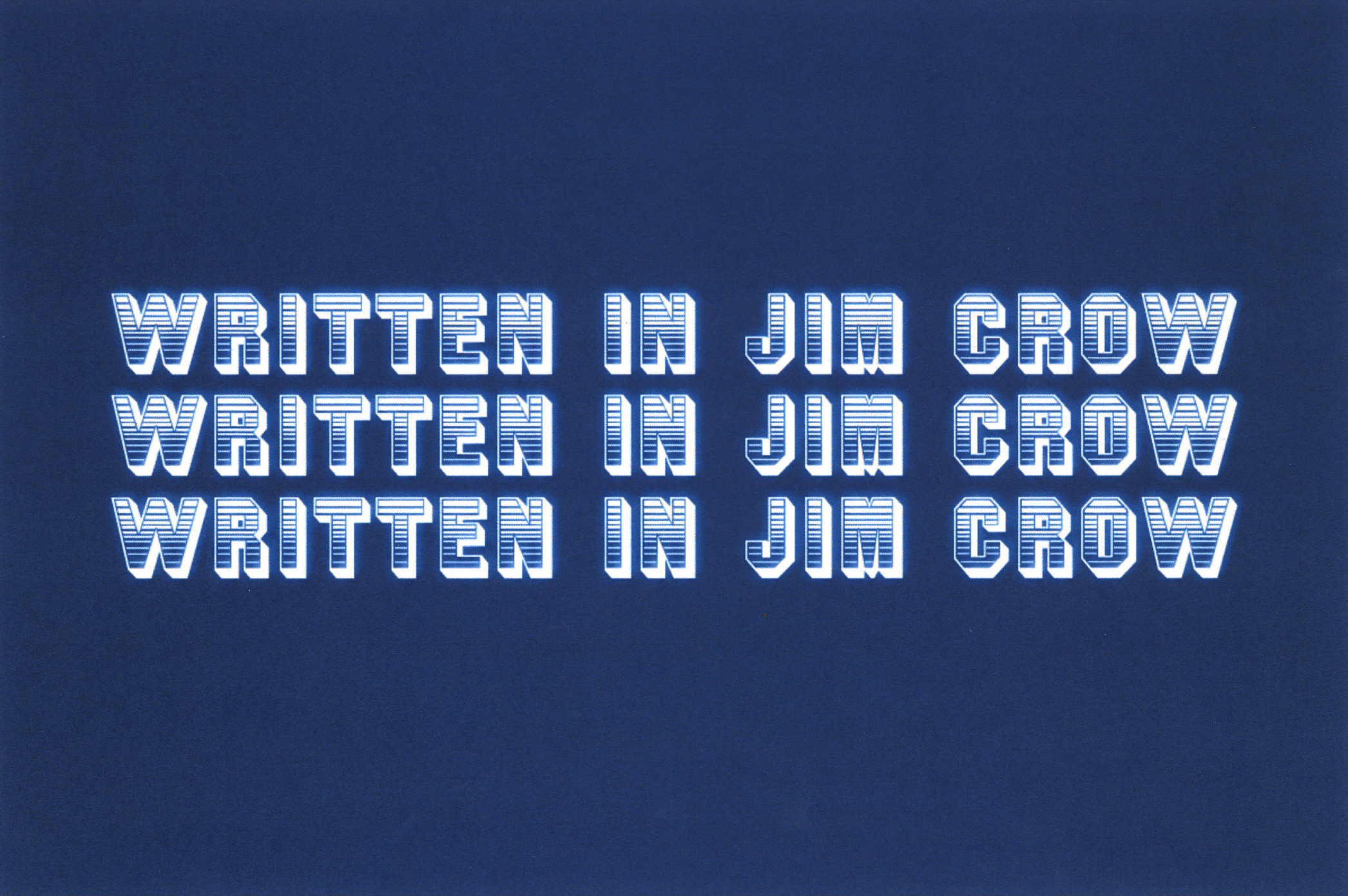
Graphic designer Archie Boston remembers the moment he first came across the Jim Crow typeface. He and his brother, Bradford, were flipping through thick type specimen books in 1967, looking for a typeface to use in the logo for their new advertising and design agency, Boston & Boston. When he came to the page displaying the Jim Crow typeface, he saw it as the continuation of a white joke at the expense of Black people. He wasn’t surprised: “You know, we had grown up in a racist society ourselves. We grew up in Jim Crow.” The Boston brothers, who are African American, experienced their childhood in a totally segregated St. Petersburg, FL in the 1940s and 50s. For Boston, ATF’s decision to name a typeface Jim Crow at a time when Jim Crow laws were in full effect “is a reflection of racism from that period.”
Yet, aesthetically, Archie and Bradford Boston liked the typeface. “It’s strong, it has a gradation, which gives it an uplifting feeling” Archie Boston told me. The boldness and stripes of the typeface felt almost patriotic to him. “I have always been a jokester, I do things to try and get reactions, you know, whether positive or negative.” So Archie and Bradford decided to turn the Jim Crow joke upside down. The Boston brothers would use Jim Crow as their logotype.

It was a message to the design world. “We are going to use Jim Crow and we’re going to use it to make you crow!” Boston said. He relished the irony of Black designers embracing the typeface. “It made a statement,” he said. “We are Jim Crow. You see that black ampersand between those patriotic colors? That’s who we are. We are Black men who are using this and we’re going to do work that is better than yours.”
In Boston’s memoir, Fly in the Buttermilk, he writes about experiencing racism throughout his career as the first Black art director at a major advertising agency in Los Angeles. At a time when it was difficult for Black designers to find work, the Boston brothers marketed themselves as “Equal Opportunity Designers.” They created posters that put their race front and center and used dark humor to comment on racism in American society. “It was our way of being active. We weren’t out marching and protesting, but we were using our design to make a statement,” Boston told me. Some of the Boston Brothers’ work that played on KKK and slave auction imagery ruffled feathers—but it also got them attention—which is what a good advertisement is supposed to do.
In 1991, Boston designed a piece for the New York Poster Exhibition titled “We’ve Come Too Far To Turn Around.” Boston told me the poster was meant to be inspirational, to “encourage people to keep fighting, keep moving forward, keep trying to pursue racial equality.” It lists different names that African American people have been called by whites since arriving in this country over 400 years ago. At the beginning of the list is the word “SLAVE,” which Boston presents in the Jim Crow typeface. At the end of the list, next to the year 2000, there is no typeface at all, but a commonly printed nineteenth century image of a self-emancipated man, swiftly running with a rucksack on his back.
Boston has continued to use the typeface over his long career; it became part of his brand. But if he were a young designer today, he wouldn’t choose it. Instead, he told me he’d use a typeface that is more elegant and sophisticated, like Goudy, his favorite. “It has a playfulness to it, concave letter forms, that’s almost like riding a wave when you look at it,” he said. “It’s got swagger.”
As much as Archie Boston’s style is irreverent, Tré Seals style is earnest. Seals, 28, is the founder of Vocal Type Co, a digital type foundry with a mission to diversify design, specifically in the realm of typography, which Seals considers “the basis of any good design.” As a young African American designer in 2016, he started to feel that the world of design was monotonous; everything had a similar aesthetic. On a whim, he looked up the demographics of the design industry and found that only 3% of designers practicing in the United States identify as Black. The imbalance of representation in the design world had been reported decades prior by Cheryl D. Holmes Miller in her seminal article for Print Magazine, “Black Designers: Missing in Action.” Holmes Miller wrote a follow up in 2016, which Seals took as a call to action. He loved typography, but he felt that it needed to expand beyond the European trends that have dominated the last century: “The problem with design being white-dominated is that it’s one culture telling stories of other cultures.”
Since founding Vocal Type Co. in 2016, Seals has developed more than ten new typefaces. Each tells a story that highlights a piece of racial or gender history. His most popular typeface is “Martin,” inspired by the lettering on the “I AM A MAN” poster and others used in the Memphis Sanitation Strike of 1968, where Martin Luther King Jr. delivered his last speech before being assassinated. Other typefaces honor civil rights champions W.E.B. Du Bois and Bayard Rustin, and transgender activist Marsha P. Johnson. But it was his typeface “Ruby,” named in honor of Ruby Bridges, the first child to integrate a previously all-white elementary school in the South, that grabbed my attention. Ruby is Vocal Type Co.’s reclaiming of ATF’s Jim Crow. “I saw the name Ruby as something that kind of puts an end to that name, Jim Crow, just like Ruby Bridges kind of started the end of the Jim Crow era and segregation laws. And I saw a historical beauty to that,” he said.
Ruby and Jim Crow are similar looking typefaces; the biggest tweak was the name. The idea to reimagine Jim Crow actually came from one of Tré’s followers on Instagram, a white letterpress printer named Rory Sparks. Sparks had a set of Jim Crow metal type in her shop, but the name bothered her so much she couldn’t bring herself to use it. The type just sat in a drawer, untouched. One day, she had the idea to rename it “Ruby.” She reached out to Seals and suggested he create a new digital version of the font, with the new name.[6] He immediately started working on the project. Seals thought the name Ruby was a lovely way of “turning something that’s racist into something that’s empowering.”
One of Seals’ pet peeves is “stereo-typography”—things like east Asian restaurants with brush-script logos—and in particular, he takes issue with the way designers often use “black weight” (very thick and bold) font to signify African American culture. For example, the Neuland typeface (designed in 1923 by Rudolf Koch) has been used on many covers of books by Black writers, like Richard Wright’s Native Son. One theory on the origin of the association of these black-weight fonts with Black culture is that they evoke woodblock typefaces printed on nineteenth century tobacco ephemera—an industry closely linked with slavery. Needless to say, much of this material featured racist imagery of African Americans. When Seals was contracted by HarperCollins to design a cover for Charles Blow’s The Devil You Know: A Black Power Manifesto, he definitely was not going to use a “black weight” font. Instead, he designed the cover with Ruby.
When the onset of new printing technologies in the second half of the twentieth century rendered metal type largely obsolete, ATF went into steep financial decline. The company declared bankruptcy in 1993 and liquidated its Elizabeth, NJ factory in a frenzied auction. Some of ATF’s old typefaces that evaded the scrap metal heap ended up at the Smithsonian, including Jim Crow. But Jim Crow is not just a museum piece; it continues to be sold by a type foundry in Arizona and printed by vintage type enthusiasts.
When I was searching through the Smithsonian’s materials, I stumbled upon a collection of brass matrices of assorted “Jim Crows.” These are moulds for casting metal “ornaments” in the shape of the eponymous minstrel character. The ornaments were used to print the raggedy Jim Crow image on reams of paper—newspapers, books, minstrel advertisements, and more. Peering at the scans of the matrices on my computer screen, I struggled to see the details in the Jim Crow faces. Zooming in, they pixelated into grotesque shadows, crude anonymous lumps. On some of the figures, I could faintly see the outlines of an exaggerated grimace. I thought about how ornaments and type were used to print the discourse of their time. Even after all the paper has disintegrated, these metal objects remain: fossils of our past communication, a record of what people were writing, thinking, laughing, and arguing about. They tell us what entertainment our ancestors consumed, what politics were on the rise.
At the end of the day, what is the Jim Crow typeface without its name? A blocky, esoteric nineteenth century decorative typeface of limited usage. Without the name, and its connections to a minstrel past, it may have faded from print altogether; the name is what sold the typeface, what kept it in the marketplace. The majority of readers may still remain unconscious of the name when they encounter the typeface, simply absorbing the impact of the design. But knowing the name highlights the entrenched and pervasive presence of racism: how it has seeped into everything in America, all the way down to our type.
[1] McGrew, Mac. (1993): American Metal Typefaces of the Twentieth Century (Second, Revised Edition). Oak Knoll Press, New Castle, DE.
[2] Low De Vinne, Theodore. (1902): The Practice of Typography: A Treatise on the Processes of Type-making, the Point System, the Names, Sizes, Styles, and Prices of Plain Printing Types, Volume 1 (Second Edition). Century Company, New York.
[3] Bullen’s papers are held in the ATF collection at Columbia University’s Rare Book and Manuscript Library.
[4] The original type was likely melted down when ATF’s factory was commandeered for the WWII war effort.
[5] The Jim Crow typeface can be seen in the poster’s subheading, in the word “FEATURE.”
[6] A previous digital version of Jim Crow was created by Harold Lohner, called Jim Dandy.
Thanks to Nina Porzucki from Sarah Kramer for her help in conceiving this essay.
More Reads
Close Read: Thiago Rodrigues-Oliveira, et al.
Veronique Greenwood
Take the W: Entry Points
Katie Heindl
Credit: Creative Commons, johnmac612, CC BY-SA 2.0. When I started writing “seriously” about basketball eight years ago (before that, I wrote NBA fan fiction for David ...

