Bill Friedman, the sage of casino management, spent twenty years trying to figure out why some gambling halls are empty and others full. “The only variable that differed,” he concludes in Designing Casinos to Dominate the Competition, “was interior design.” In today’s Las Vegas, the aesthetic of excess that characterized the megahotels of the ’90s is losing favor. When the MGM Grand opened its doors in 1993, visitors followed a “yellow brick road” carpet from the entrance to the slots, perhaps unconsciously humming “If I Only Had a Brain.” Fifteen years later, with the age of heavily themed design in decline, the casino’s carpets have been reduced to a pattern composed almost entirely of reddish hues and interlocking arabesques, the signature lion’s head silhouette barely rising to the fore, no broomstick or ruby slippers to be seen.
In the so-called sawdust joints of the ’40s and ’50s, floors were for cigarette ash, dust, and vomit. The owners of the Last Frontier (which later became the New Frontier, then simply the Frontier) went as far as hauling an antique bar from Gold Rush–era San Francisco and procuring a lavish collection of animal horns from around the world, but never thought to cover the floors. But the days of cowboy boots sinking into soiled wood shavings were numbered: World War II ended, the Flamingo opened, and Vegas was glamorous—and more to the point, carpeted, the floors blanketed in newly invented synthetic fibers and lustrous faux-Orientals.
The decorative phase that spanned the end of the Vietnam era to the dawn of the Clinton years can be compared to the stupid glee experienced by a child who has just been given a 124-count box of Crayolas with Mauvelous and Purple Pizzazz. (The crimes committed against color in this period would find their apotheosis in the fuchsia and aquamarine floral nightmare plastered to the floors of the old Mirage—a pattern only Don Johnson could love.) The payoff? Vegas became the entertainment capital of the world, a meretricious emblem of the American century’s zenith. Realtors and merchandising associations brought their conventions to Treasure Island and New York, New York (Giuliani’s program of sanitization had yet to convince them), and even the Europeans came in droves, following Baudrillard across the Atlantic to the land “where things lose their shadow, where money loses its value.”
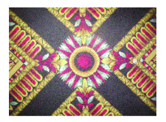
Refuges of simulation remain: at the Hotel Paris, a vast field of flowers carpeted in the impressionist style still leads visitors through a Giverny of video poker and complimentary mai tais. But hotels and casinos are increasingly looking to trade gimmickry for packaged elegance, starting with the carpets. Oddly, many of the new floor-coverings feature forms and figures that would look familiar to the so-called nonobjective filmmakers, animators, and painters emergent in the first half of the twentieth century, such as Oskar Fischinger, Jordan Belson, and the Whitney brothers—call it visual Muzak. On a recent trip to Las Vegas I saw densely packed geometries, monochromatic patterns, abstract figures in various stages of metamorphosis. The new carpets at Harrah’s appropriate the quivering striations of Georgia O’Keeffe’s Music—Pink and Blue II and wash all tension away with buckets of brown and orange. At the Mirage, russet amoeba cartoons exchange organic matter over a tan backdrop. At Carson City’s Nugget Hotel, Paul Klee’s Variations (Progressive Motif) is amplified beyond the bounds of good taste and supersaturated in canyon hues.
In Vegas, the visual motifs developed by the synaesthetic milieu—long since appropriated by commercial design—are charged with the creation of flow through distinct, intimate spaces, in accordance with the Friedman standards. Like Muzak, the designs not only soothe and guide guests, but also encourage personal identification with the spaces. Denuded of themes, the rugs no longer tell you where you are as much as who you can be—namely, a sophisticate, a player. At the Wynn, the exemplar of modern design in Las Vegas, a Gee’s Bend–patterned carpet leads visitors from Louis Vuitton to the roulette tables to Daniel Boulud’s French bistro; the spare floral motif is echoed not only on the ceiling but on the shuttle bus that runs to the hotel’s golf course. “Wynn wanted the hotel to be made up of a bunch of small experiences connected by one idea,” says casino design expert Dr. David Schwartz.
Mark Pilarski, a longtime Vegas insider and consultant, agrees that the abstract geometric patterns are used “to break up the space,” in accordance with the Friedman standards. But he also contends that, for those in the business, “the main reason is that your eyes are focused to look up at the machines. You just can’t keep looking at that busy pattern when you’re walking.” A solid pattern, he adds, “would look like a football field. I’ve seen this once—the casino looks like the runway of an airport, like infinity. But the guests don’t want that, they don’t want it to be infinity out there.” ✯


